Fountain Pen Review: Aurora Duo Cart

The Aurora Duo Cart fountain pen is a re-creation of the original Duo Cart of 60 years ago.  If the photo on the box is any indication, only minor alterations have been made to the original design. Originally, the name came from the pen’s ability to carry two cartridges, the one it was using and a spare. Hence the “duo cart.” The modern version comes with a converter which occupies the majority of the barrel and modern cartridges appear to be a bit longer making it difficult to fit two in the barrel, though the bane lives on. [click here to continue reading]

Montegrappa Heartwood Review

I’m a fan of the Montegrappa Fortuna in general – it’s an excellent example of classic pen design modernized to take advantage of the diverse materials available to pen makers today. That said, if I had to recommend one version of the Fortuna over all others, it would be the Heartwood. I absolutely love the look and feel of this pen. [click here to continue reading]

Aurora 88 Pen Review

This is a review that I’ve been working up to for a couple of months. In that time, I’ve used up the entire volume of ink that this thing holds. It’s got a fine nib, and that’s a lot of use for me on a single pen. This is one of those pens that I just kept reaching for. [click here to continue reading]

Pen Review: Montegrappa Game of Thrones Ballpoint & Rollerball Pens

Montegrappa has mastered the art of the licensed pen with the Game of Thrones collection. They created four pens to represent major families represented in the series: House Stark, House Lannister, House Targaryen and House Baratheon.  From the packaging to the aesthetics of the pens, Montegrappa managed to do high-end licensed pens right.

I was lucky enough to get to take the House Stark ballpoint and the House Lannister rollerball out for a test drive. [click here to continue reading]

Game of Thrones Limited Edition

The Iron Throne Pen is limited to 300 fountain pens and 300 rollerball pens in sterling silver with vermeil accents. The number 300 depicts the year of settlement of the last of the Targaryen kings in 300 AC. There will also be 7 fountain and rollerball pens made of solid 18k gold to represent the 7 kingdoms of Westeros. The fountain pen is piston-fed with an 18k gold nib engraved with the images of the coveted throne.

At the cap’s top, surrounded by the swords’ hilts, is the Game of Thrones logo. The pen’s barrel is fashioned in precious metal with the lost-wax casting technique. The barrel represents the saga through symbols evocative of the houses of Westeros. Details of the pen, from the Targaryan dragons to the Lannister lions, are enriched with flaming white celluloid.


To represent the intricacies and complexities of the Iron Throne itself, Montegrappa’s artisans have fashioned a cap formed of overlapping swords representing the seven kingdoms. Their hilts rise above the cap’s top to create a crown, the pommels and blades running the length of the cap itself. Standing proud is a sword that serves as the pocket clip, its hilt bearing a fiery red ruby.


A Night Out With U-Boat’s Classico Tungsteno

The U-Boat Classico Tungsteno continues to grab attention through a bold statement of luxury. The polished tungsten case – mind you, at 50mm –  is hard to miss, as its personality is typically an extension of its environment.


There’s a confidence that comes with strapping an oversized Italian beast, that isn’t your typical glitz. The Classico shines in its own light with illuminated numerals cast over an Arabic numeral dial and vintage leather strap.

There are moments to “suit up” with your Sky Dweller, but not tonight. Tonight we’re in Montreal, The Hub, Ocean Drive or wherever your passions drive you.


Click here to view the technical details


Aurora 88 Minerali Azurite Pen Review

I fell in love with the Aurora 88 Minerali Azurite the moment I saw it at the Chicago Pen Show. It was a very early preview, and I wasn’t able to share it at the time. I got the go ahead a few weeks back and shared it on Instagram, and now the same pen has returned to my hands for this review thanks to Kenro Industries.

When talking about this pen on the podcast I mentioned how if I were designing a pen for me that it would look a lot like the Minerali lineup. All five of the upcoming models have a clear demonstrator barrel with one of five color accents – Azurite, Diopside, Amber, Cinnabar, Amethyst – and each are limited to 388 units. [click here to continue reading]

LA Arts District Welcomes a New Talent

“I have always drawn, ever since I was a child. Then a few years ago I discovered fountain pen inks and their fluidity, so my creative journey (which has included sculpture, painting, three-dimensional paintings and video art) shifted focus to the distinctive mark generated by the fountain pen, Italian-born artist, Celio Bordin, explains to Kenro Industries’ Bryan Hulser. Bordin “discovered the Aurora fountain pen in an old stationery store in a remote village in Piedmont, Italy.” Hulser of Kenro Industries, became acquainted with Bordin, online, and recently had the opportunity to visit him and watch him perform in his studio in the Arts District in downtown Los Angeles (DTLA). Though Bordin expresses himself in line drawings that are created with vintage Aurora Magellan fountain pens on stretched canvases, they are performances nonetheless. Watching his process is every bit as mesmerizing as regarding his finished products.

Hulser watched as Bordin balanced one edge of his stretched canvas atop an orange traffic cone, while the closer edge rested against his thigh. He placed the fountain pen filled with custom pigment he mixed himself on the surface of the canvas and he waited. He waited for the emotion to rise within, and then his fountain pen nibs took off at a frenzied pace, as if it had a life of its own. At first glance, this self-taught and critically acclaimed artist, seems to be chaotically scribbling across the canvas. The scratching sounds of his nib against the rough surface of the canvas fill the air with a frenetic rhythm, reminiscent of Itzhak Perlman playing Paganini Caprices 01/05/24. Where Paganini pushes the violin, a classical instrument, to its limits with his compositions and Perlman pushes it to its limits with his skill; Bordin does both with this vintage Aurora fountain pen, known for its refined lines and sophisticated character. And when he’s done, a face has emerged from the chaotic tangle of inked lines. He refers to these faces as “presences,” and upon closer inspection, the eye focuses on smaller faces within the larger one. The images are beautiful and haunting.

Against the gritty backdrop of LA’s Downtown Arts District, with his vintage Aurora Magellan fountain pen in hand, Bordin finds inspiration; and, just as the gentrification of the abandoned industrial area has brought new life to the place, Bordin’s intense energy breathes new life into a vintage pen. His images, the complex layering of lines, thin and thick, light and dark, speak to the gritty, messy stories of life. The strength of past lives comes through in his haunted images, and the sturdy nib, which is ready to withstand, the intensity that Bordin wields. His art speaks well to the history and culture of this area and perhaps humanity, the rise and decay, the fall and reemerging of community and life. There is something apocalyptic yet magical in his energy, tools, and process. The energy is palpable. Not in words, but in images woven from the pigmented thread of his emotions and story that flow through the nib of his fountain pen.

2017 DC Fountain Pen Supershow

To say that the 2017 DC Pen Show was special, would be an understatement. This was not your typical 9 to 5 trading event, rather a “penfest” complete with worldwide, socially active writing enthusiasts. From the moment we arrived the new venue in Falls Church, the halls were a buzz with familiar friends from our ever growing community. There’s something to be said that people traveled from as far as Sweden and Taiwan to exchange laughs and dip pens.

Our Kenro team was charged up for an exciting weekend and the results exceeded expectation. You see, this year’s event wasn’t about the introduction of that special pen. For us, it was about the community and having a chance to spend time with likeminded talented friends. There was the pre-show filled with creative workshops, mid-day artistry from celebrity guests and of course the post show socials. This weekend had it all!

There were many special moments from the weekend and although we couldn’t capture all the fun, we did manage to collect a bunch that we think you’ll enjoy!

Add Some Color To Your Life With Montegrappa’s New Ink Line

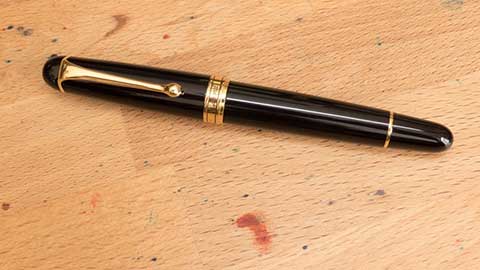
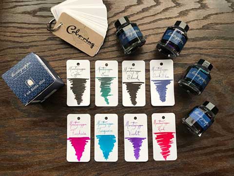
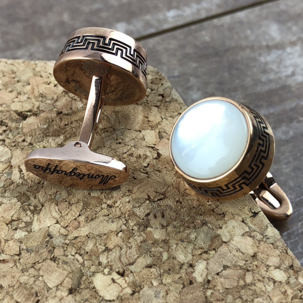
The name Montegrappa is synonymous with craftsmanship and luxury. Kings, queens, and popes are counted among those who use Montegrappa writing instruments. With over a century of experience creating leather goods, timepieces, and of course fountain pens, it is a name one can trust not to disappoint. Their collection of inks is no exception. The newest collection features the colors:

Black
Coffee Brown
Dark Blue
Fuchsia
Green
Red
Turquoise
Violet

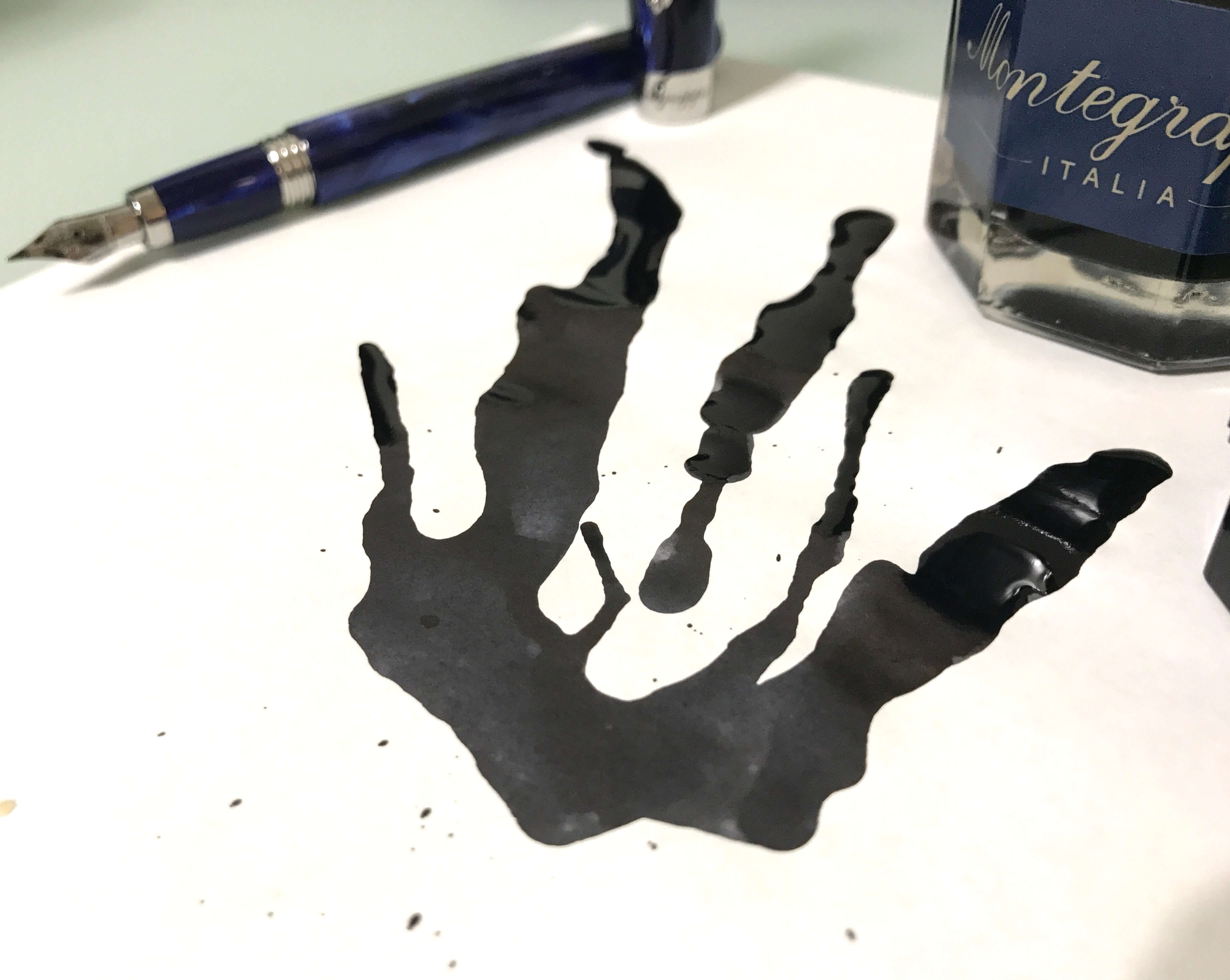
These inks come in a 50ML octagonal glass bottle, packaged with care in classic Montegrappa blue.

Specifics about inks:

Montegrappa’s new take on Black ink has a wonderful range of color, spanning from hints of grey to deep black. The ink has an excellent flow, yet is not overly wet, and dries to reveal lovely shading. Despite this, it is heavily saturated, making it perfect for personal or professional writing.

Montegrappa Coffee Brown is a deep brown with hues ranging from a milky chocolate to the tone one would find in black coffee. The flow is wet and dries to a subtle shading. It is a heavily saturated ink that is suitable for many occasions.

Montegrappa Dark Blue is reminiscent of the night sky, with tones of navy that range to a near black. This ink has a lovely consistent shading and even flow. The saturation makes it suitable for personal or professional writing.

Montegrappa Fuchsia is a playful mix of pink and purple tones. It is has a high flow and robust color that does not allow for much shading. However, this leaves the writer free to enjoy the bright, festive color of the ink. It would be a delight for correspondence writing.

Montegrappa Green is a peppermint green that has a fresh, crisp shading from dark to light. This ink has the added bonus of sheen which adds a deep red shimmer where the ink is most saturated, giving the color added dimension.

Montegrappa Red is a bright crimson that ranges from deep to light tones. This ink has a moderate flow, with sporadic shading. This color can add drama to any paper it is applied to.

Montegrappa Turquoise is a vivid ink that has the tones of the Aegean Sea. From tranquil waters to a vast ocean blue, this ink flows nicely and has a delightfully wet flow. This is a saturated ink that is both a pleasure to write with and read.

Montegrappa Violet is a bright purple that shades from hyacinth to an almost eggplant purple. This ink has radiant highlights and an average flow. These attributes make it perfectly suited to correspondence writing and art.

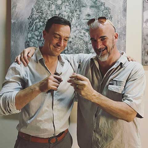
For more cool content by Squishy Ink, check out Krystle’s instagram account here
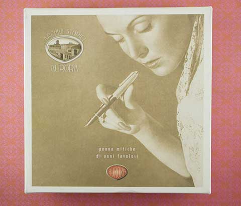
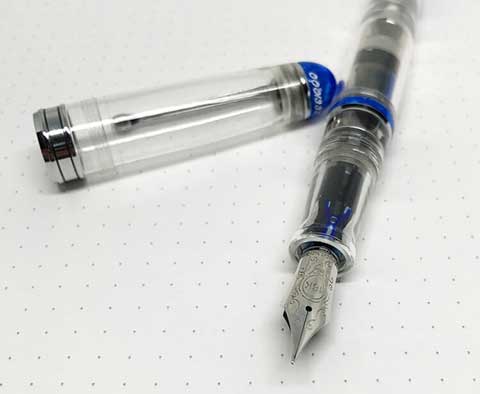
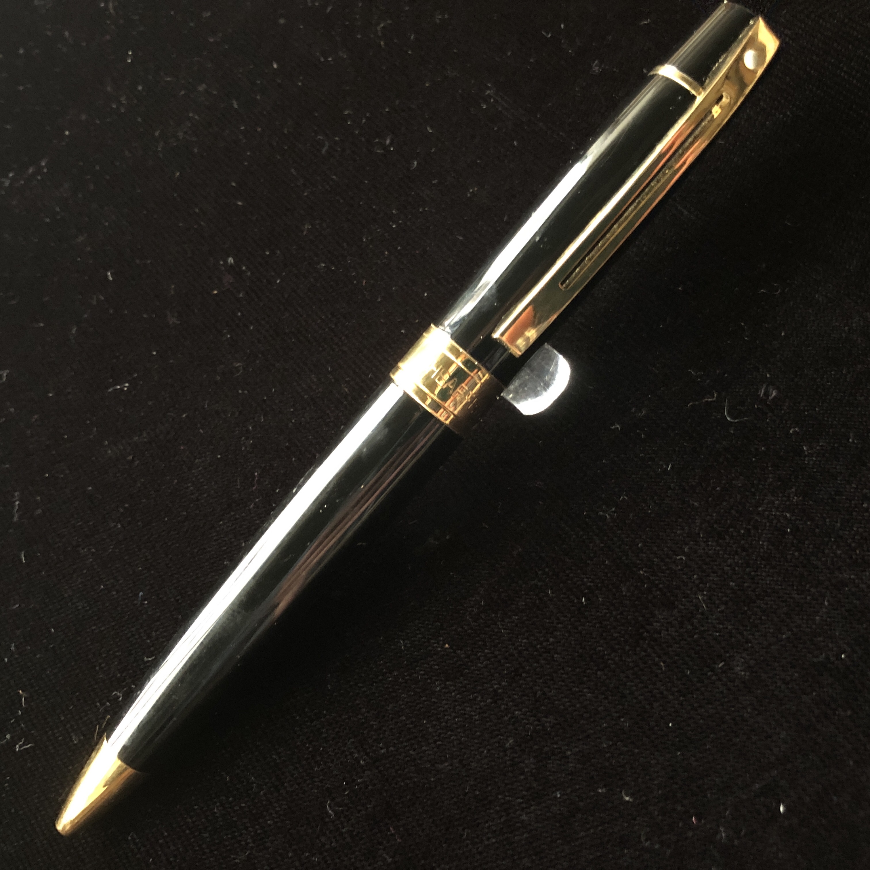
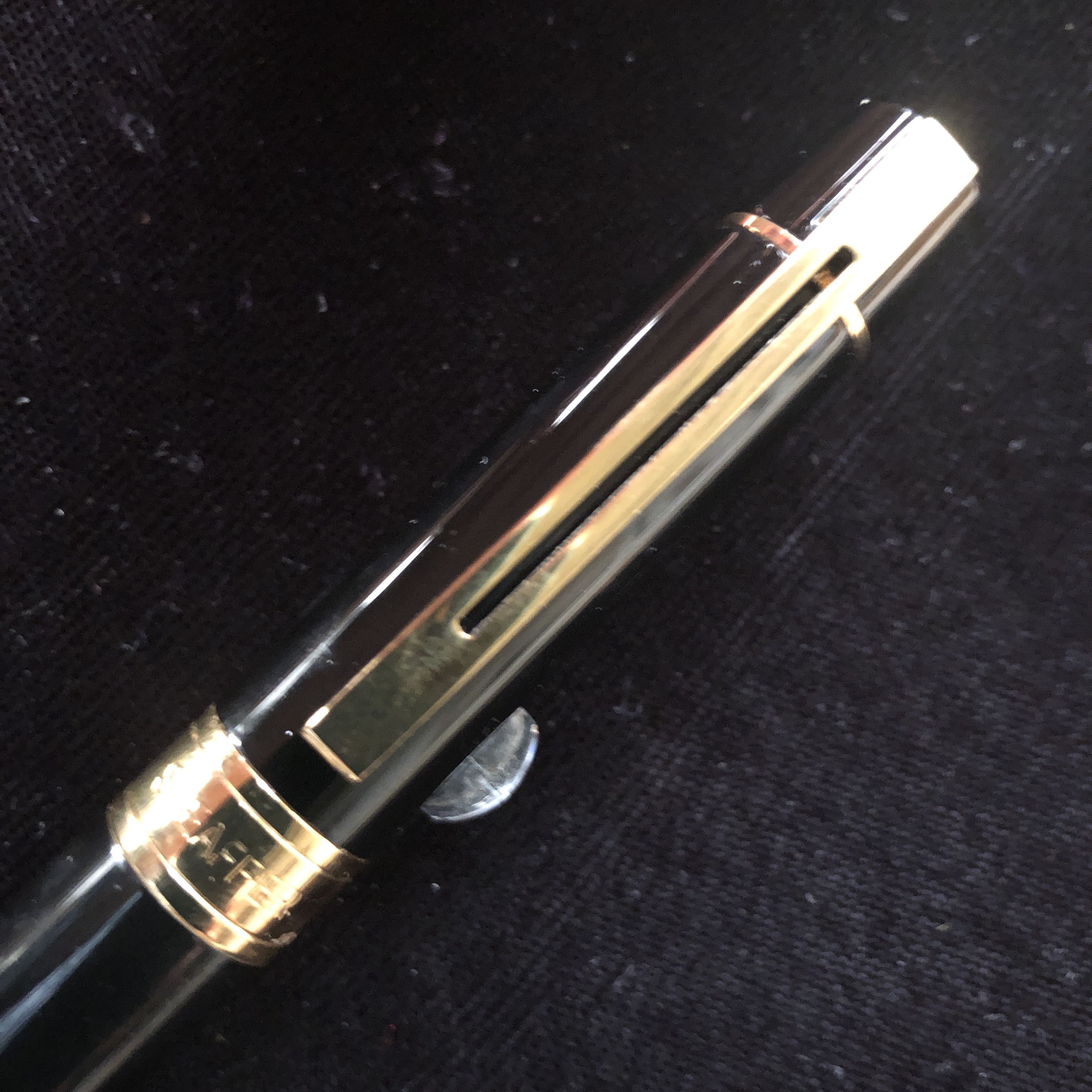
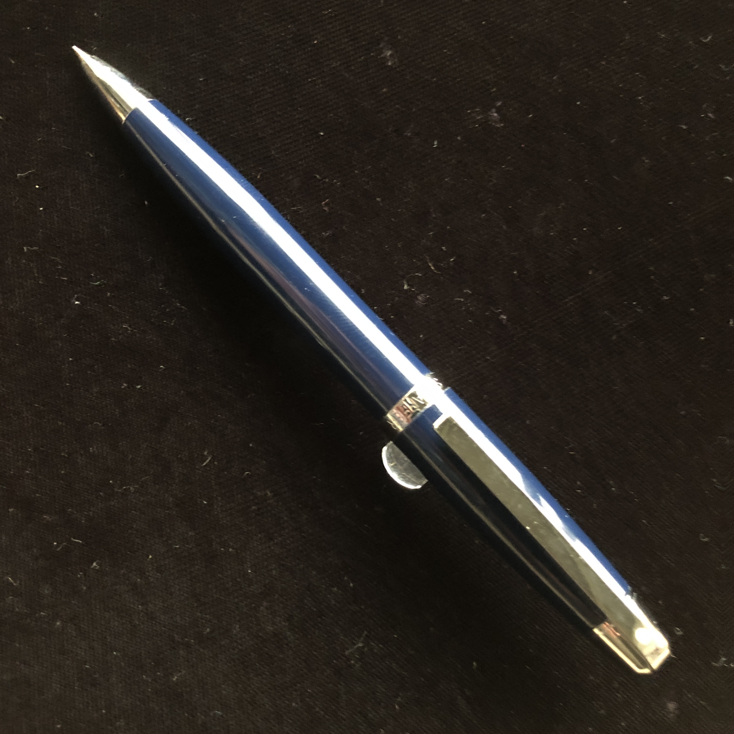
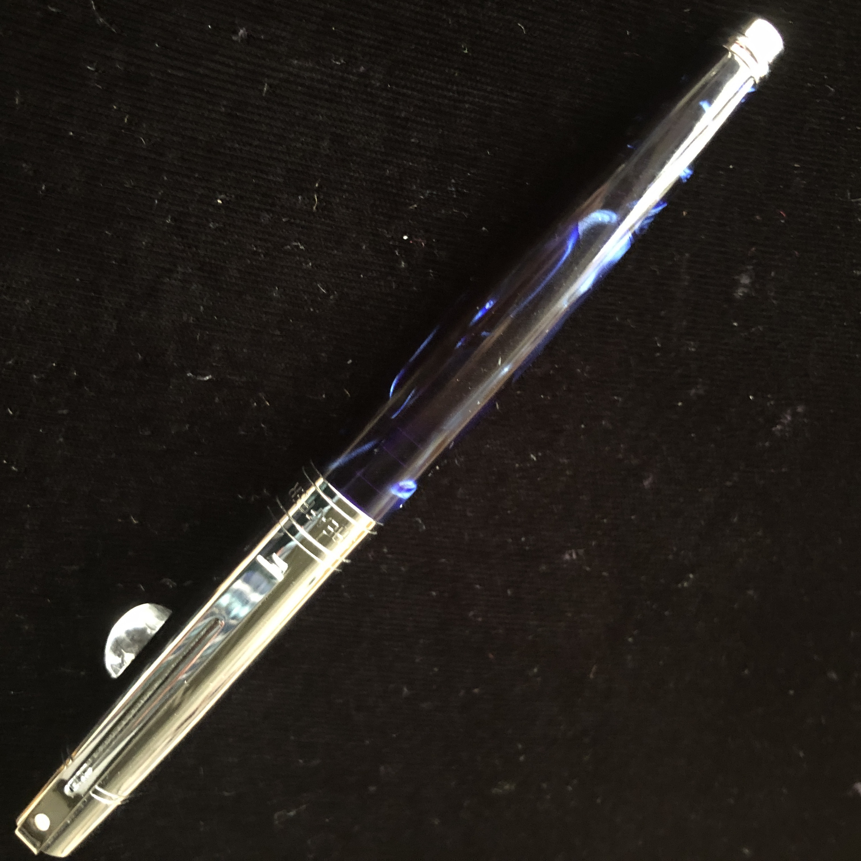
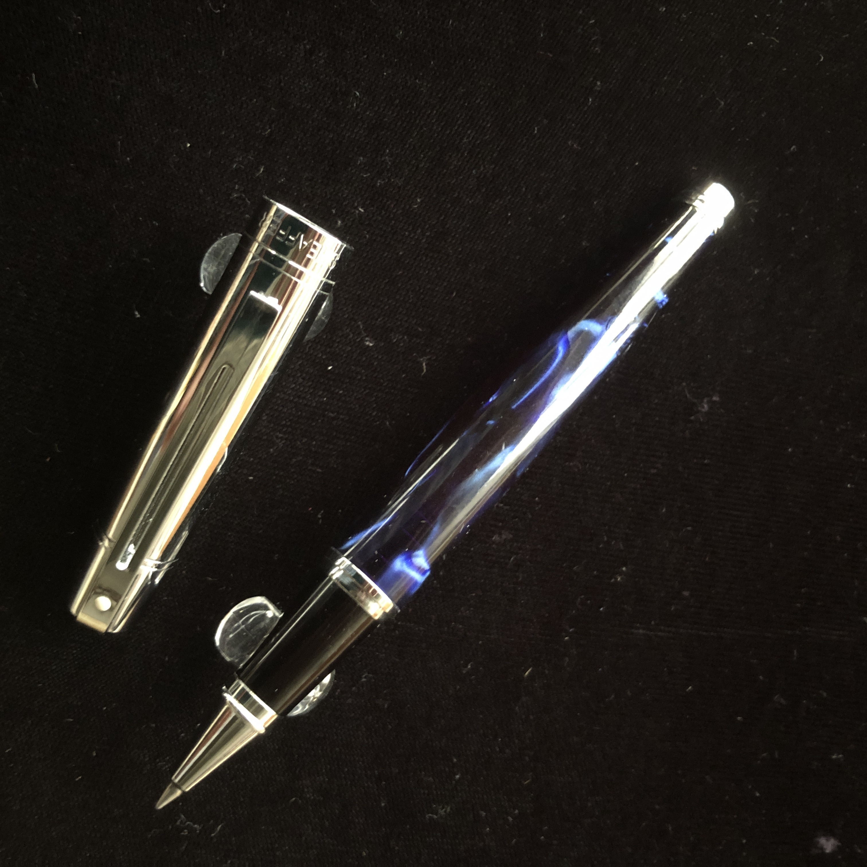
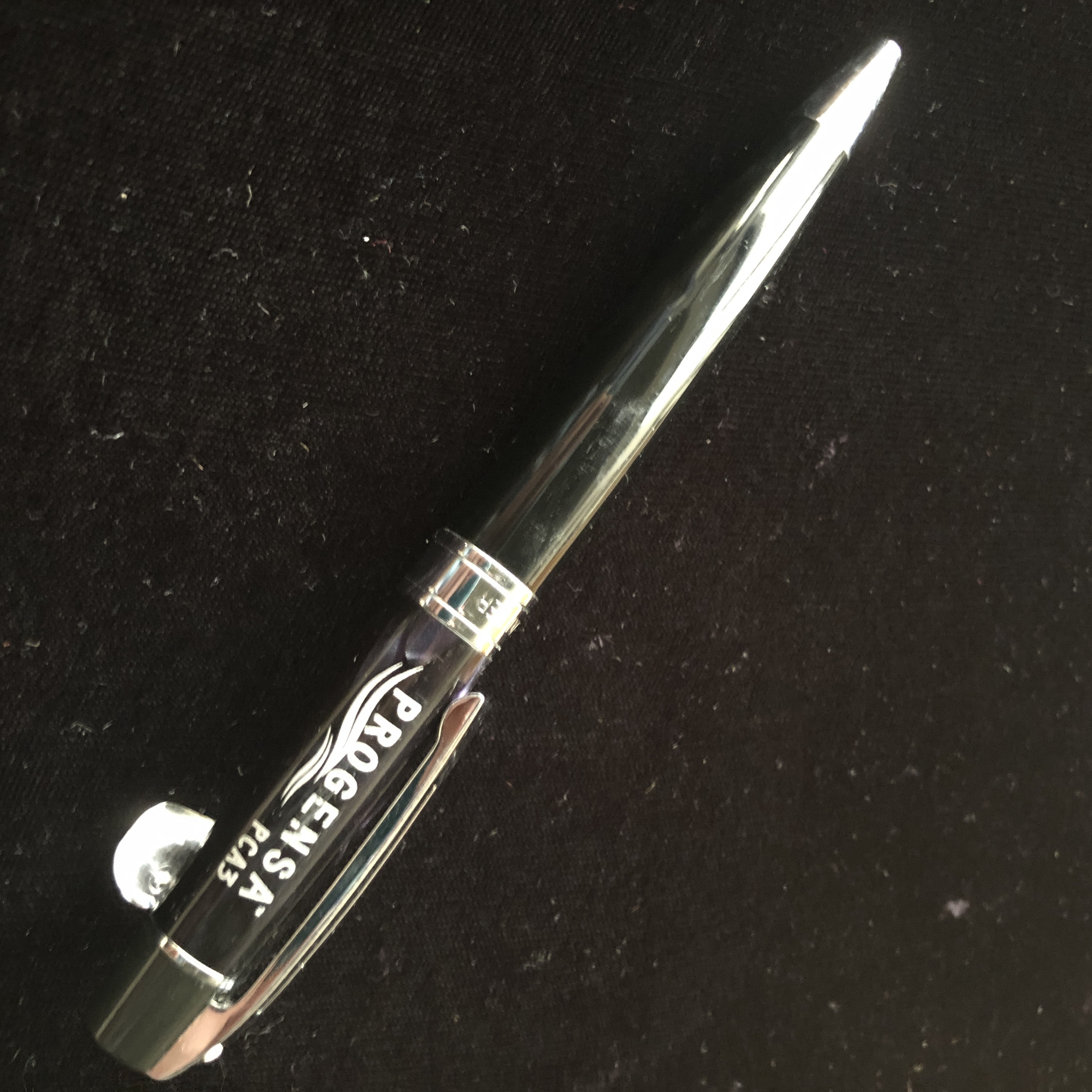